Friday, May 4, 2012
WEEK 12: Magazine Cover and Back Cover
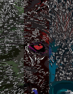
For the cover and back cover, I was not sure what would really encompass all of my content inside the magazine. Even though, now it seems obvious that the wolf would be the grand de vue, at first I wasn't so sure my art could be modified in the way I wanted. I almost wanted to snag a photo from the web that was was a lot better. The cover is, if anything the place to show your artwork to the world, therefore, taking somebody else's work would be inept for such an occasion. Nate Peck gave me the idea of enlarging the photo and zooming in on one of the wolf. That made sense in a way, not just artistically, but also psychologically and from a strategic stand point. Not being able to see the whole image might intrigue people to want to see the rest of the magazine and find the wolf throughout the content. Therefore, I decided it would be best to still give a little more of the photo so that the viewer can recognize that it is part of a wolf but not too much so that they have all of the artwork revealed to them.
I inserted the Adobe Illustrator artwork into InDesign and scaled it to the size of the page. For the back cover, I placed three rectangles dividing the picture of the wolf into three vertically-long sections. The picture of the wolf was the ninth variation and the boxes were green, red, and blue. I made the boxes transparent and also added the "color burn" effect. I wanted to show something different than what I had inside the magazine, hence, the transparent boxes. This experimentation allowed me work my way back to the first and last page inside my magazine. By simply adding a colorful rectangle in front of the wolf, I was able to completely change the perspective and have a different feel for the wolf.
For the front cover, I wanted something that was not altered too much, but still represented the essence of my magazine's content. I didn't zoom in too much on the front cover, as opposed to the back cover, because I did not want people making the mistake of confusing the wolf for a bear or something else. I felt that the text I used needed to go with the theme of "wolf;" thus, leading me to the "Dirt2Death" font which reminded me of a ware wolf type of lettering. I also placed a black background with yellow text in front to resemble a dark night and a yellow moon...something that is classic in horror films and reminds me of wolfs. I included my name in the same color scheme and also the subtitle, however, I changed the fonts to something that was a little less hectic and more easily read.
Subscribe to:
Post Comments (Atom)


No comments:
Post a Comment