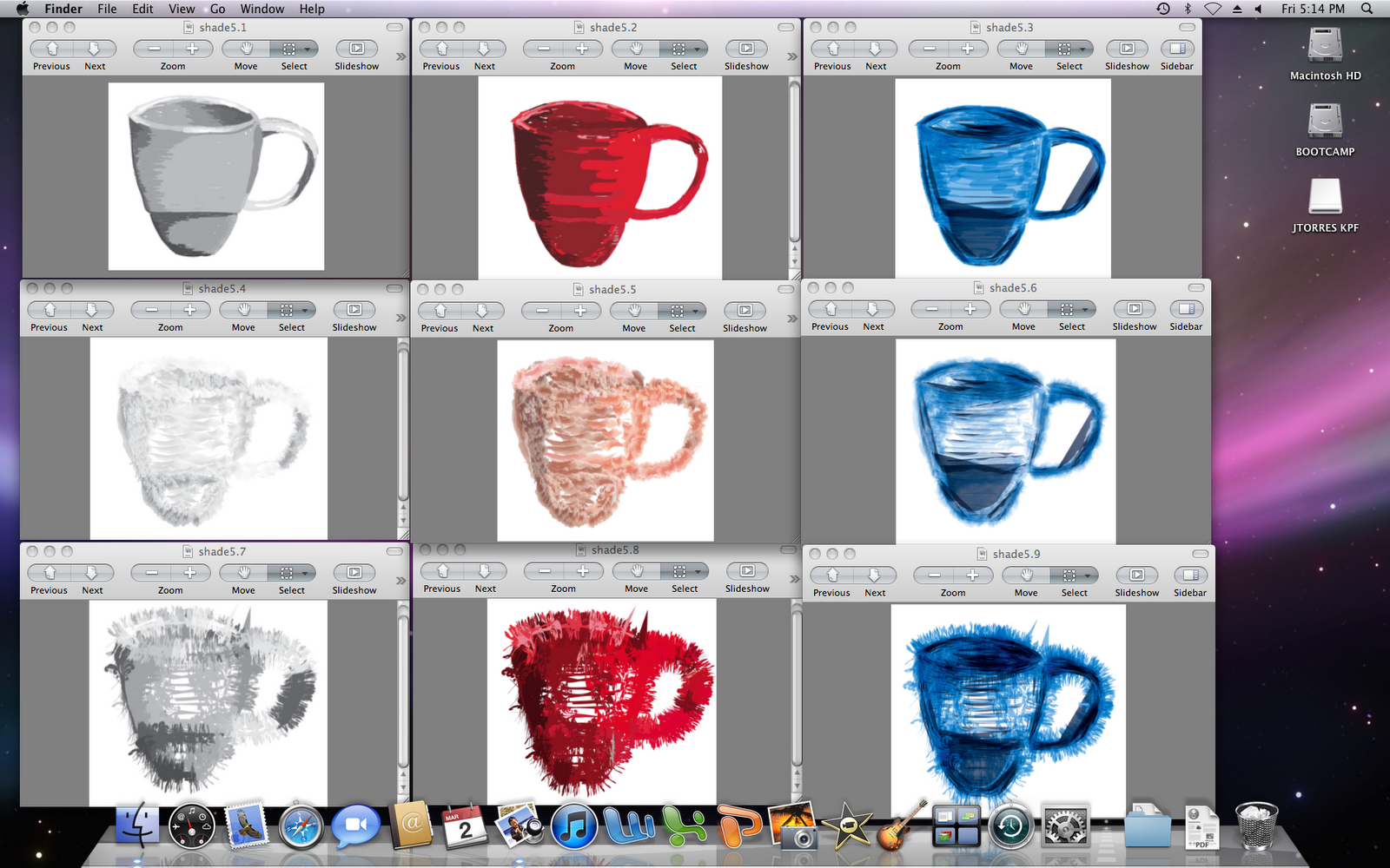
Composition: Starting from the upper left hand corner, we have one, two, and three in sequential order, going from left to right. Similarly, the row that follows below the first row contains the fourth, fifth, and sixth variations, in that order. And lastly, the third row contains the seventh, eight, and ninth, illustrations. This organization made it possible to form a sort of grid in which the top row acted as a basis of color change, and the first column (left) focused on brush stroke. From there on, it was like bingo, where you combine space "B" with space "2" to get the new result of space "B2."
The foundations for all of these was the first variation, otherwise known as the original. Painting number 2 was designed to show a single chroma, ranging from a dark crimson to a light pink. Number 3 had multiple hues, but focused mostly on the shades of blue, along with "multiply" transparency. This brought about a sort of aqua feeling to the design- giving the feeling of water and fluidity. The interesting aspect of variations 4 through 6 is that they change relative to your position to the screen. When focusing on the vertical axis, if you look down on the screen, they seem to fade, almost vanishing. When it is tilted away, it becomes much more defined and it looks darker (personally think it looks better). In a way, the cup loses its shape and it almost seems like it can be a map with a multitude of mountain ranges, showing the shadowed side and the lighted side. This, in turn, gives a sense of depth and dimensions. Variations seven through nine seem like they would hurt to try to sip coffee from. Like the second row, they give the impression of being spiky and look like they would feel like thorns. Nevertheless, they do not seem as rough nor have a sense of depth, with the exception of the ninth cup. The seventh and eighth cup look like they are a beautiful decorations that seem 2-dimensional. They look like tattoos or interesting stamps. The ninth cup is not as abstract and is by-far the most interesting. This is because it captures the essence and structure of the cup, while still showing artistic value and intricate designs. The aura gives it a shinning look to it, while the blue values keep your eye going in a wave pattern, like water.


No comments:
Post a Comment