Friday, May 4, 2012

WEEK 15: Final (Designer Comparison)

After watching a few films about art, I decided to write about Banksy in Exit Through the Gift Shop, and Stan Lee in Comic Book Confidential.

BANKSY


Craft: For most of his work, Banksy seems to work mostly with a unique stencilling technique in his graffiti.  For this bottom picture, in particular, it represents that very unique style of utilizing stencils.  It seems this was done on a concrete wall of a building, perhaps an alley.  The drawings are of a two Star Wars maned-walkers, the AT-ST (smaller), and the AT-AT (larger).  The lettering "..I am your father" is a famous phrase referrencing the Star Wars saga.  Banksy does not use much color at all, but rather focuses on very fine details in black in white.  He has all the right shading and is very precise in the scaling of his art.

Composition: The stencil drawings seem to attract your eye first.  Then you head toward the imporvised sections which consist of the quote and the question mark.  He has both droids looking towards each other as if they are interacting as unmanned living organisms.  It gives a sense of confrontation before you read the lettering, and afterwards a sense of paternal instinct.

Concept:  It is obvious that this is meant to be a parody or Star Wars, if not, at the very least it is making fun of it.  The bigger AT-AT is giving the impression of being a parental figure (the dad more specifically, after you read the statement).  The smaller AT-ST strikes you as a small child.  When the AT-AT says "I am your father," mimicking what Darth Vader says to Luke Skywalker, the AT-ST ponders the statement and is left in udder confusion as to how this is possible or implying, "Really? You're my father?" 


STAN LEE

 
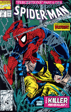
Craft: As a world-renowned classic comic book artist (and everything else he's done), Stan Lee has left his mark in history.  The Marvel comic book of Spiderman and Wolverine edition depicted to the right can be seen to show a tremendous amount of color, detail, and style.  It really focuses on shadows and exaggerates them, making them really dark. The yellow and red really grab your eye, while the blue hues complement each other.  Darks and lights are are mixed and intermingled, yet still show a lot of organization and complementing when looking at how the colors are arranged.  After being drawn in by the superheroes, you go to the title, then the subtitle, and finally all the sub headings.  They are all in crazy fonts, but appropriate for the atmosphere.

Composition:  The cover seems pretty hectic and chaotic with a lot of stuff in it even though it only has two characters. I appreciate all the chaos because it goes with the style of the comic.  So much stuff wanting to be in the cover, that it suprisingly makes you want to open it and read what the heck is going on.  You are interested in the idea of two superhereos crossing over and being in the same edition.  Even if you didn't know who these two were, both of these characters seem pretty interesting and freaking cool with web going everywhere and Wolverine looking fierce. It seems that the different hues of green are so sublte and almost boring that they help bring out the hot-colored characters out more to the foreground.

Concept:  This is obviously a comic made for entertainment featuring Spiderman with "gues-star," Wolvernine.  It is a comic about action-packed superheroes who beat the bad guys and show that justice prevails.

When comparing Banksy with Stan Lee, it is quite a shift from one artist to another.  Banksy is a mysterious and infemous graffiti artist more centered on the political side of things.  On the other hand, Stan Lee is more of a fantasy guy, creating all of these crazy and amazing fictional characters.  He relates to kids and even adults depicting what he knows we would all like to be.  He does this in a way so as to also give the statement that all heroes are not superheroes.  Sometimes it only takes an average person to do a courageous act of justice to become super and be good in society.  Banksy is a little more devious and does not play by the law.  In a way, he is more of an anarchist which seems to get him fame and adoration from his fans, while resentment and problems arise on the side with the law.  His graffit has a distinct look to it. When you look at it, you automatically know: "Ah, that's Banksy." Similarly with Stan Lee, when you look at his comics, you know that the colorful action-packed superheroes on the cover are his signiture.  Both are fasinating people who try to speak in the way they can- through art.  They both try to send a message and hope that people hear and understand it. 

WEEK 14: Website publishing

After we had published our magazines online, we had to do a bit of reasearch on websites that specialized in viewing pdf's online.  While we waited for the hard copies to arrive at SXU, we investigated which websites meet certain requirements for posting and viewing an electronic copy of our pdf's.  The requirements were: a site that hosted PDF's, full screen capabilites, had limited or no adds, was able to view the pdf in 2-page spreads, was public, would never expire and always remain on the website, and most of all, that it was free.  Among the many websites that we found as a class, we discovered many pdf hosting sites, but some had defects or did not meet enough requirements.  MediaFire.com looked great but required payment. I tried freefilehosting.com but it sucked and just seemed like a online storage webstie.  The ones that worked out pretty good for many, or at least for me, were Issuu.com, Youblisher.com, and Scribd.com.  In all three, I was able to upload my pdf's and view them on the web.  Below are the embedded pdf files of all three websites as proof that they work well.

ISSUU


YOUBLISHER
Howl


SCRIBD
Magazine Jtorres Finalexport Interactive

WEEK 13: Lulu publishing and link

The focus of the week was to find a way to publish our magazines.  Luckily, Mr. Peck had already found a website that published magazines, books, and other material in a short amount of time and for free (unless you wanted to purchase a copy).  This website was Lulu.  We started out by making an account in which we could submit our work. Since they would only accept our magazines in PDF's, we had to convert our InDesign formatted magazine into a Portable Document Format (PDF). After going through the various steps to name, tag, properly cite/give credits, and everything else that is required in the legal publishing process, we were able to submit our pdf.  Our front and back covers, however, had to be uploaded seperately as jpeg's. In the end, we purchased two copies, one for Natha Peck and the other for ourselves.  With the cost for two copies coming out to under $40, we were glad to recieve them in about 10 buisinnes days.
The link to my published magazine is:  http://www.lulu.com/shop/jonathan-torres/howl/paperback/product-20048973.html where you can buy a purchase your very own copy.

WEEK 12: Magazine Cover and Back Cover


For the cover and back cover, I was not sure what would really encompass all of my content inside the magazine.  Even though, now it seems obvious that the wolf would be the grand de vue, at first I wasn't so sure my art could be modified in the way I wanted.  I almost wanted to snag a photo from the web that was was a lot better.  The cover is, if anything the place to show your artwork to the world, therefore, taking somebody else's work would be inept for such an occasion.  Nate Peck gave me the idea of enlarging the photo and zooming in on one of the wolf.  That made sense in a way, not just artistically, but also psychologically and from a strategic stand point.  Not being able to see the whole image might intrigue people to want to see the rest of the magazine and find the wolf throughout the content.  Therefore,  I decided it would be best to still give a little more of the photo so that the viewer can recognize that it is part of a wolf but not too much so that they have all of the artwork revealed to them.

I inserted the Adobe Illustrator artwork into InDesign and scaled it to the size of the page.  For the back cover, I placed three rectangles dividing the picture of the wolf into three vertically-long sections.  The picture of the wolf was the ninth variation and the boxes were green, red, and blue.  I made the boxes transparent and also added the "color burn" effect.  I wanted to show something different than what I had inside the magazine, hence, the transparent boxes.  This experimentation allowed me work my way back to the first and last page inside my magazine.  By simply adding a colorful rectangle in front of the wolf, I was able to completely change the perspective and have a different feel for the wolf.

For the front cover, I wanted something that was not altered too much, but still represented the essence of my magazine's content.  I didn't zoom in too much on the front cover, as opposed to the back cover, because I did not want people making the mistake of confusing the wolf for a bear or something else.  I felt that the text I used needed to go with the theme of "wolf;" thus, leading me to the "Dirt2Death" font which reminded me of a ware wolf type of lettering.  I also placed a black background with yellow text in front to resemble a dark night and a yellow moon...something that is classic in horror films and reminds me of wolfs.   I included my name in the same color scheme and also the subtitle, however, I changed the fonts to something that was a little less hectic and more easily read.

Wednesday, March 28, 2012

WEEK 11: Final 22 two-page spreads


After going through many changes and getting critique from fellow peers and the instructor, I revised a few things.  I also realized that I was not going to have enough content for the magazine if I wanted it to be a magazine of just MY work.  I had really hopped for more time so that I could illustrate a few more pieces of artwork, but I will have to make due with what I have.  In order to help witht his dilema I did two things: added a contents page and I also really increased the size of the images.  By scaling up the illustrations I was able to stretch the content over more pages while still looking good.  It was just a matter of organizing the body text around it, increasing the font size of headings, and really using the negative space to my advantage. 

I started the last polishing revisions by rearranging the content and focusing more on the text fonts.  I decided to start with the line drawings instead of the shape drawing because I wanted to show the final stage of the wolf illustration as a whole 2 page spread.  I order to do that and not warp or distort the image by the middle crease, I had to place it in the middle.  I aimed for page 20-21 but had to compromise for pages 26 to 27 because it would have disruppted the order of images with line drawing to shape drawing and back to a small section of line drawings. This way, the magazine is divided into two main sections: line and shape, but still sub-sections. 

I included many black long rectangles in the vessels variations sections in order to change it up and bring the illustration out to the viewers attention.  With the wolf, I added an additional spread that depicted the process of how I pieced together the wolf through the use of various shapes, brushstrokes, hues, and effects.  When it came to text, I downloaded many of them from the "1001 Free Fonts" website and used them in the headings.  I used fonts such as: Seven Monkey Fury, Dirt2 Dirtstalker, Kelt Caps Freehand, Angelic War, NeverSayDie, etc.  I also included the information on the photograph of the original wolf since it was taken from the internet and not owned by me.

WEEK 10- 10 page spreads


In continuation to Week 9's Blog, I started working on the next 8 spreads and editing the last two to get a total of 10 spreads done by the 10th week of class.  I soon noticed that I was going to be unable to keep up my ideal proportionality for all 20 spreads due to the fact that I did not have enough artwork nor enough text.  Therefore, I had to start spreading my artwork out and decided to really utilize negative space, along with making use of color boxes.

I completely changed the layout of the first two spreads and added on more content.  I figured that since my wolf was the focal point of my magazine, why not make it a lot bigger.  Therefore, I expanded the final wolf illustration along with the heading and a quote so as to attract the reader to the rest of the content.  From here on, I started taking color from the actual artwork on the spreadsheet and applying it to the text, color boxes, and background to complement the page theme.  I wanted to divide the sections into categories: real wolf, variations of wolf, 100-stroke drawings, color and texture drawings, and start the value drawings. 

With the wolf variations, making the whole (9) wolf pictures larger seemed like something I should focus on, rather than the collage of variation wolfs.  When I transitioned into the line drawings, I wanted to make the background with complementary gradient hues, ranging from green to indigo.  After that I went to the color and texture illustrations which I felt needed to stand out, hence the white background.  From there I went into the value drawings.  A background that was grey, text that was white, and boxes that were black really complemented the shadings since they where black and white and all in between.


WEEK 9- 2 Page Spreads


The assignment was for us to create two-page spreads for our magazine using Adobe InDesign CS5.5.  I started by working on my highest quality piece of work, which was the wolf shape drawing.  By using various boxes, I was able to enter text and images into the spreads.  When it came to "body copy" or the text that explains the content, it was required to use 10-font Arial or Times.  We had to use at least four order of text, which meant that there had to be four different fonts types in the page.  I did not really get too creative with text styles, since I wanted to prioritize organization and layout.  The title, headings, and page numbers all helped in providing the different orders of type.   The content I wrote in the text boxes came from my previous posts of how I had created the works of art.  I also included a new element by incorporating a quote that complemented my wolf theme.

When it came to the images, I decided that the final result of my wolf illustrations was the climax of my magazine so it should be relatively big in comparison to the other artworks.  I did not want to go any borders and I still had not really decided on including a background color or layout. 

On the first spread, I started out with the normal wolf and how it evolved from a simple drawing made from big shapes to a contrast showing the actual wolf photograph and the wolf final result.  On the second spread, I decided to do a sort of mix of my variation wolfs in a way that they were all cut at different places and put together so as to illustrate a full wolf made up of all of my variations. After that I felt it was necessary to show each individual variations by itself in order to grasp the whole visual image.  It was also important for me to show the viewer how it slowly progressed to such a dramatic change in a variation. 

This would of been my ideal layout for all pages: proportionality in both images and text.  

Sunday, March 4, 2012

WEEK 8- TRACE DRAWING: Wolf Variations

Craft: (See Composition for arrangement of variations concerning number order) Picture number one is the original, depicting the wolf as it is in the actual, real-life photograph.  It has as much color and detail as was necessary to duplicate the photograph through artistic means. The second wolf is the first monochromatic variation.  I chose blue values for most of the wolf and background, but made the eyes values of yellow.  Variation number three uses a plethora of hues, ranging from reds, to grays, to blues, to purples and greens.  When dealing with this extreme chromatic change, I also used different colors to contrast the fill and the outline colors.  Illustration number four through six use a subtle brush called "Marker- Rough" for most of the picture, with the exception of some fine hairs and the eyes.  Variation five mixes numbers two and four and their respective elements.  Variation six also combines numbers three and four.  When we get to third row (numbers seven through nine), we see the less subtle brush, "Text Divider 1."  Again, variation eight brings together features from both prior variations, number two and number seven.  This also applies for variation nine, acquiring its present form from a combination of variations three and seven.

Composition: Starting from the upper left hand corner, we have one, two, and three in sequential order, going from left to right. Similarly, the row that follows below the first row contains the fourth, fifth, and sixth variations, in that order. And lastly, the third row contains the seventh, eight, and ninth, illustrations. This organization made it possible to form a sort of grid in which the top row acted as a basis of color change, and the first column (left) focused on brush stroke. From there on, it was like bingo, where you combine space "B" with space "2" to get the new result of space "B2."

All variations come from the basic source- the first completed wolf.  From there they branch off into different types of art forms that concentrate either on color, brushstroke, or both.  Illustration two was one of the more simple, yet interesting outcomes.  By combining values of blue, I was able to contrast the shades of yellow in the wolf's eyes.  The values complemented each other while the hues could not be more opposite.  This contrast allowed for a fierce-looking wolf, that had life-like eyes that pierced the speculator.  Variation number three combined a large amounts of hues but not as many values.  At first, I wanted to do a an all hot-colored wolf (yellows, reds, and oranges) but it came out looking like a lion.  After that, I resulted to focus on black and white, with the hint of other colors to capture an evil looking wolf.  For variation four through six, I used the "marker -rough" paintbrush.  This was not much different from the regular, plain brushstroke I used in Row 1, but it did seem like the painting was less focused and less defined.  This brush made the illusion of a foggy blur, without actually using the effect "Gaussian Blur." Variations five and six follow the same combinations as seen in the above "Craft."  Row 3 was not expected but did seem to have some positive outcomes.  The "text divider 1" brush is very noticeable and inspired me to keep it for the outside borders and not the inside hairs.  The brush was not applied to the eyes again because it distorted the eyes, which I believe are a keen aspect to preserving the soul of the wolf.  This brush had a very intriguing effect on the outside, where it stretched and made a the lines overlap, zig-zag, and exalt the sharpness and rigidity of the outer hairs.  I did not like how it looked when it was applied to the fine, inner hairs but the Illustrator program seemed to have trouble taking off this brush.  Even if this was not intended, they still seem like the wolf have a more digital look, similar to works of art which use ones and zeros to portray an object. The recurring pattern looks like something from the movie, Matrix.


Concept: The wolf that resembled a photograph is now something more that a simple depiction of an animal.  It is a continuation of different elements and effects that make up new designs.  Through many trials and errors, I was able to get many wolf variations that appeal to my eye as well as many that don't.  In either case, good taste does not matter when interpreting the various different shapes and colors.